


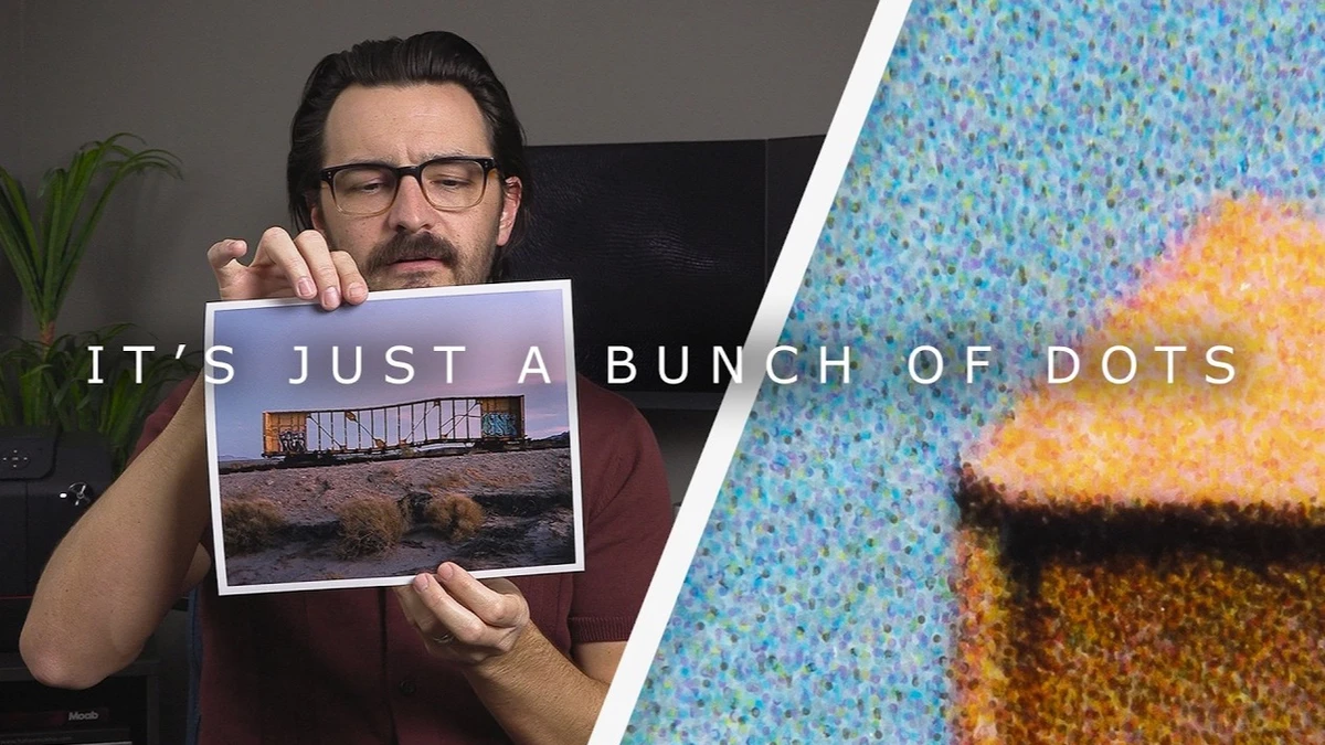
That smooth sky gradient on your inkjet print is made of tiny dots in only a handful of ink colors, packed so densely that your eye blends them into something that looks seamless. Knowing whether a print is built from dots or from light shapes how you choose a printer, a lab, and the service that prints your next book or zine.
Nick Carver sorts printing technologies into two camps, continuous tone and non-continuous tone, and starts with the kind most of you already own. His Canon PIXMA TS6420 is a basic consumer model with just cyan, magenta, yellow, and black, yet it produces full-color photos with what looks like millions of shades. Inkjet printers can’t mix ink. There’s no tiny blender inside combining cyan and yellow into green. They spray droplets of whatever colors are loaded, and by changing how often and how densely those droplets overlap, they get your eye to see colors that aren’t in any cartridge. The technique is called dithering, and his Canon imagePROGRAF PRO-1100 does the same thing with a much larger set of inks, including gray, red, and blue.
You can see the effect yourself with a 6x loupe. Hold one over any inkjet print and the droplets show up clearly, and Carver points out that what you’re looking at isn’t noise or film grain. Much of the gap between an entry-level printer and a professional photo printer comes down to how precisely and densely the machine places those droplets. Finer, tighter placement gets you more colors, more accurate color, and the potential for more resolution and sharpness. Put the same loupe over a C-print of the same image and the dots disappear, because a C-print uses no ink at all. Photosensitive paper is loaded into a machine in total darkness, and a head moving back and forth, much like an inkjet head, exposes the file onto the paper with multicolor LEDs. As it crosses a sky from blue to pink, it gradually shifts the color of the light, so nothing breaks up the gradient before the paper goes through developer, stop bath, and the rest of a wet process much like a darkroom print.
Dye sublimation is the other continuous-tone process he covers. Solid dyes are heated until they turn into a gas that bonds to a material, often metal, which is how those metal prints floated off a wall are typically made. Lab menus rarely say “continuous tone” or “dithered,” but the paper and process names tell you which one you’re getting. Prints on Kodak Endura or Fujifilm Crystal Archive paper are chromogenic, exposed with light and run through chemistry. Anything labeled giclée, pigment, or fine art on cotton rag paper comes off an inkjet printer, and metal prints on ChromaLuxe aluminum panels are dye sublimation. Each family has its own range of surfaces, longevity, and cost per print, and once you know the vocabulary, you can pick a process deliberately instead of defaulting to whatever a lab lists first. Long, gentle gradients are where the difference between dots and true continuous tone has the most room to show, so a sunset or a softly lit portrait makes a good test file. Order the same small print both ways and compare them side by side, at arm’s length and under a loupe.
Carver also turns the loupe on printed matter, starting with a zine of his own and moving to his prized copy of Gregory Crewdson’s Beneath the Roses. Both show big, widely spaced dots built from just four colors, and the expensive book doesn’t look much better than the locally printed zine. Neither came from an inkjet printer. Books, zines, catalogs, and calendars come off what the industry calls digital presses, machines like the HP Indigo that replaced the old analog printing presses. They cost over a million dollars, take up an enormous amount of floor space, and can run around 6,000 sheets an hour, roughly 100 a minute. That speed comes at the expense of quality, and Carver is open about how frustrating it is to make a zine he knows won’t match a photo printer’s output, even though a photo printer would take far longer to produce the same run.
Check out the video above for more.