



Buy a new photo printer, and the next temptation is a shopping cart full of baryta, cotton rag, and sampler packs of photo paper from every maker you’ve heard of. Paper shapes how a print looks, but telling which paper suits your images depends on a skill you can only build by printing a lot.
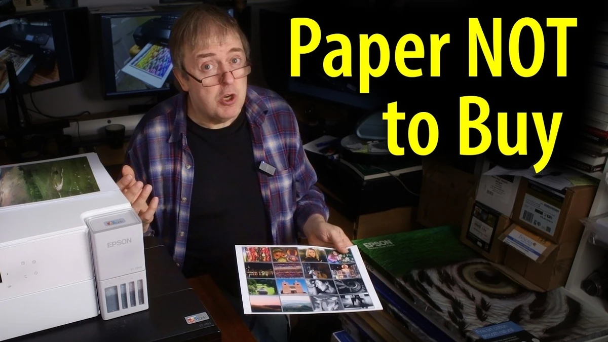
Keith Cooper takes the opposite approach to that shopping list and suggests starting with the plain paper your printer’s manufacturer sells. His office holds an Epson EcoTank Photo ET-8550, a Canon imagePROGRAF PRO-300, a Canon imagePROGRAF PRO-200, and an older Canon PIXMA G550, plus a modest four-ink Epson, and he argues that any decent current printer can turn out good prints. If the prints look bad, he puts that on the person running the machine, and he holds himself to the same standard. For the ET-8550, he points to Epson Premium Semi-Gloss Photo Paper. On the Canon side, his pick is Canon Pro Luster Photo Paper, and the reason in both cases comes down to the profiles the manufacturers provide for their own media.
Sampler packs get a more nuanced treatment than you might expect. Cooper likes them, but a pack usually holds only two or three sheets per paper, and that’s too few to learn how a surface behaves with your files. A full pack of letter-size paper gives you room to make mistakes, adjust, and print again until the results stop surprising you. The ET-8550 earns its place here because it’s an ink tank printer that runs on bottles, which keeps the cost of practice low. If you’re on a tight budget, he even suggests cutting sheets in half to stretch both paper and ink during the learning stage. That kind of volume builds the judgment a handful of exotic samples can’t.
An ICC profile describes how one specific combination of printer, ink set, and paper reproduces color, and it only works when the driver’s media setting matches the one used to build the profile. Epson and Canon install profiles for their own papers alongside the driver, so the semi-gloss or luster sheet you load already has a matched profile waiting. Third-party papers often need a profile downloaded from the paper maker’s site, installed by hand, and paired with a recommended media type that may not be obvious. Starting on manufacturer paper removes that whole layer of setup, so when a print comes out too dark or with a color cast, you can trace it to your file, your print settings, or your monitor. The same profiles also drive soft proofing in Lightroom and Photoshop, letting you preview on screen how an image will translate to a given paper before you spend a sheet. Once that preview reliably predicts the print, you have a baseline, and a new paper becomes one variable you’re changing instead of five. The principle holds for anyone learning a craft with lots of moving parts: lock down everything you can, then introduce changes one at a time.
Cooper also uses a dedicated test image with black and white areas and a range of colors as the benchmark. If you can’t get a clean, good-looking version of that file onto basic manufacturer paper, he asks what hope you have of judging whether some other paper is better. He wants you to treat the print as the end point of your editing workflow. Unless an image is meant to be shown on a screen, what it looks like on your monitor counts for very little next to how it comes out on paper, and plenty of people still regard a print in their hands as the real photograph. Then there’s his own library of hundreds of papers, gathered over years of testing. He uses two or three of them for his own prints, and most of the rest are there for testing, because he finds there isn’t that much difference between them. That’s also why he won’t name a favorite: his pick suits his images, and you need to print enough to find your own.
If a sampler pack is already sitting in your cart, play Cooper’s seven-minute video at the top of this page before you check out.